How a brand can communicate the feeling of a place?
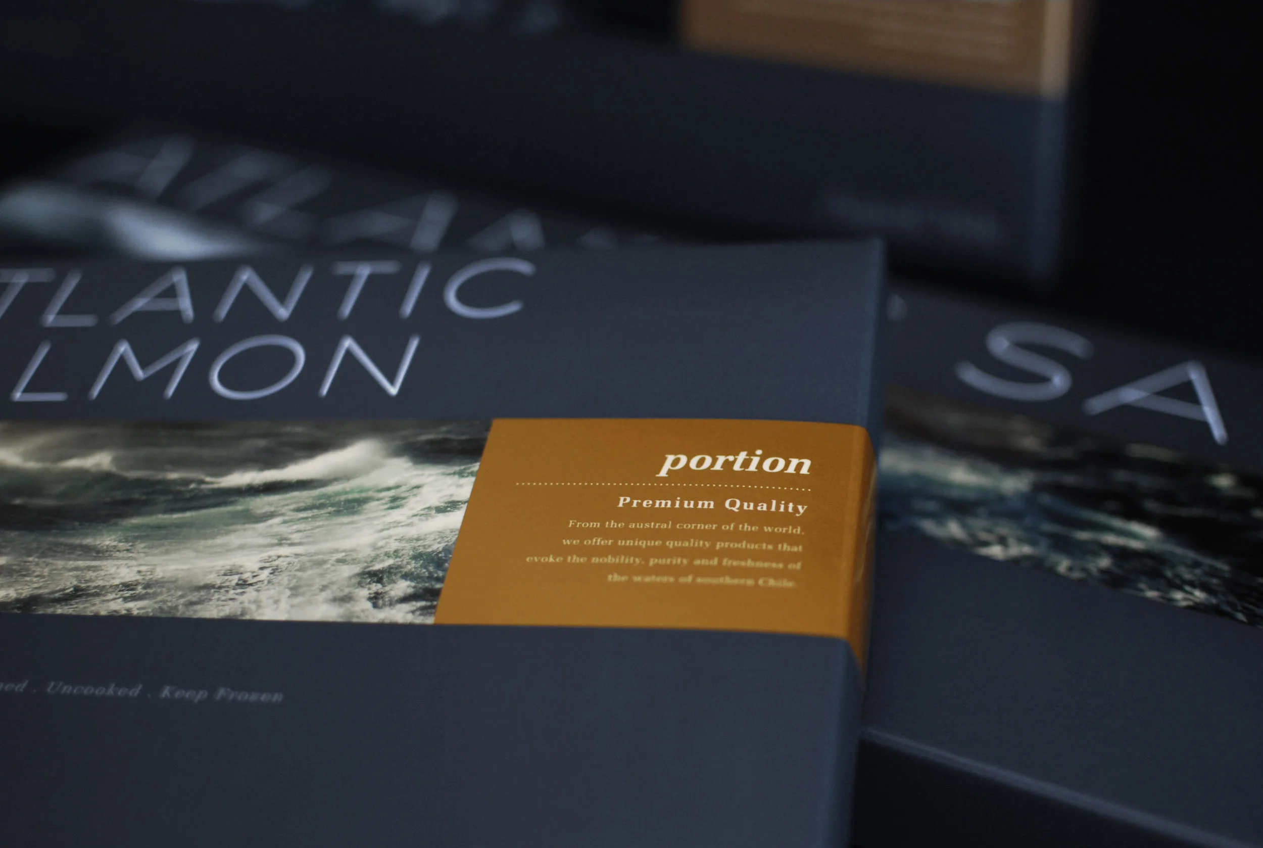
AquaChile’s challenge was to reposition the brand of the main salmon company in Chile to compete on a global platform. We sought to balance the corporate character of the brand with the remote and untamed nature of the origin of the product, with emphasis on the work of people from the south who give life to the company. The design strategy included the development of a whole coherent language for web, books, stands, offices, stores, packaging, and much more.
- Chile Diseño Award / National recognition for Best Annual Report 2013
- Clap Platinum Award 2013 / Latin America Recognition Best Corporate Identity System
*Developed with the Daniela Abad, for Porta4 Design Studio
AQC logo
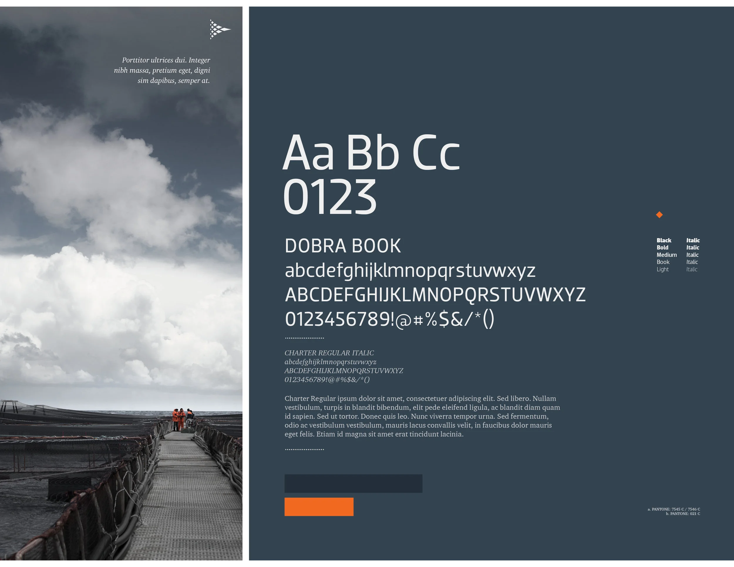
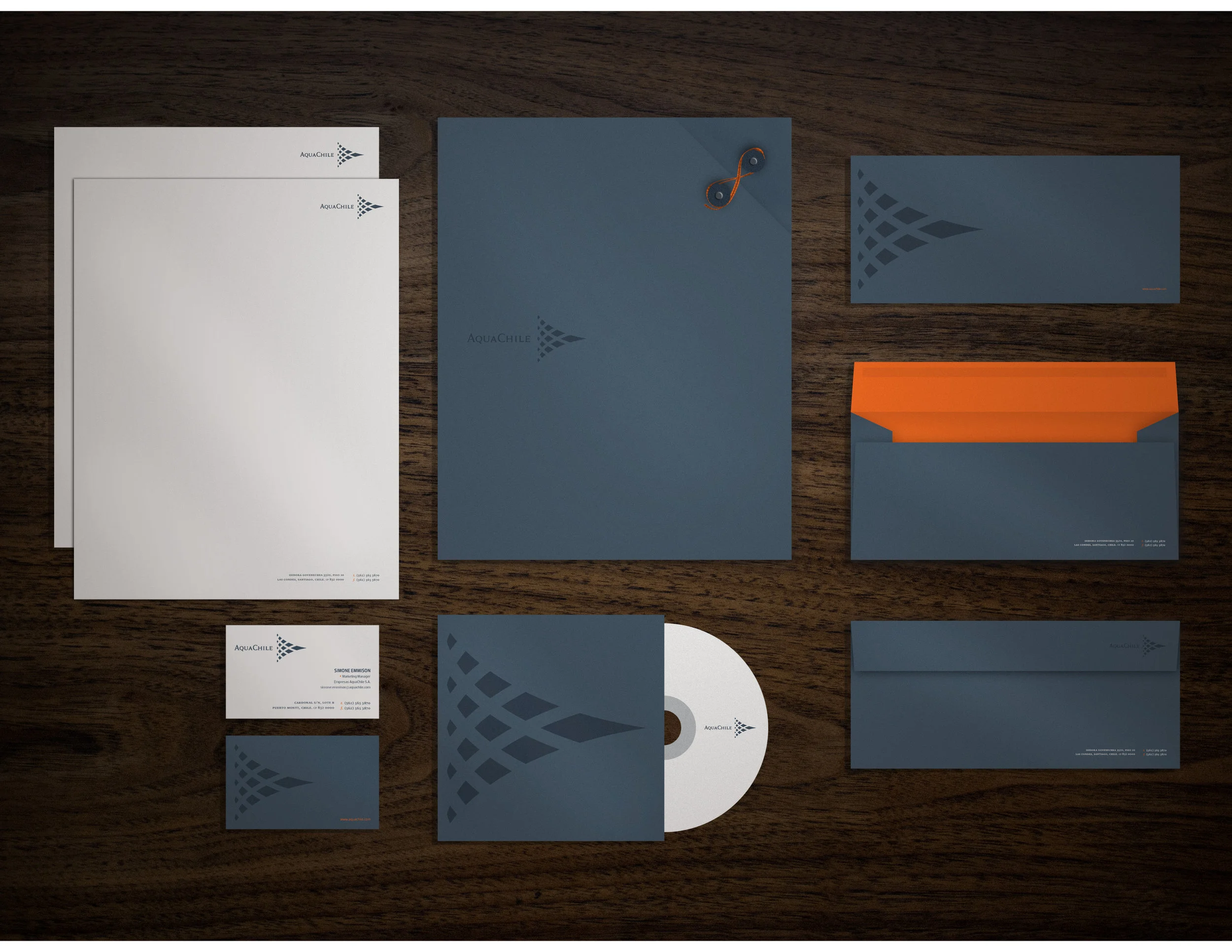
Brandbook AQC
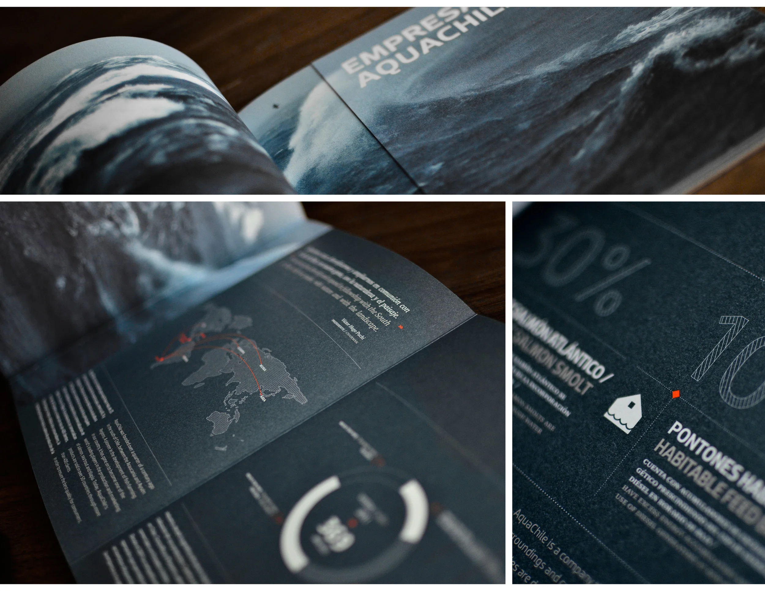
Editorial design
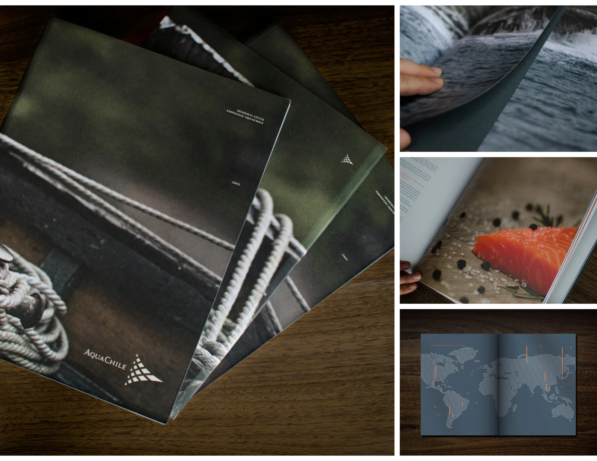
Annual Report (Premio Chile Diseño)
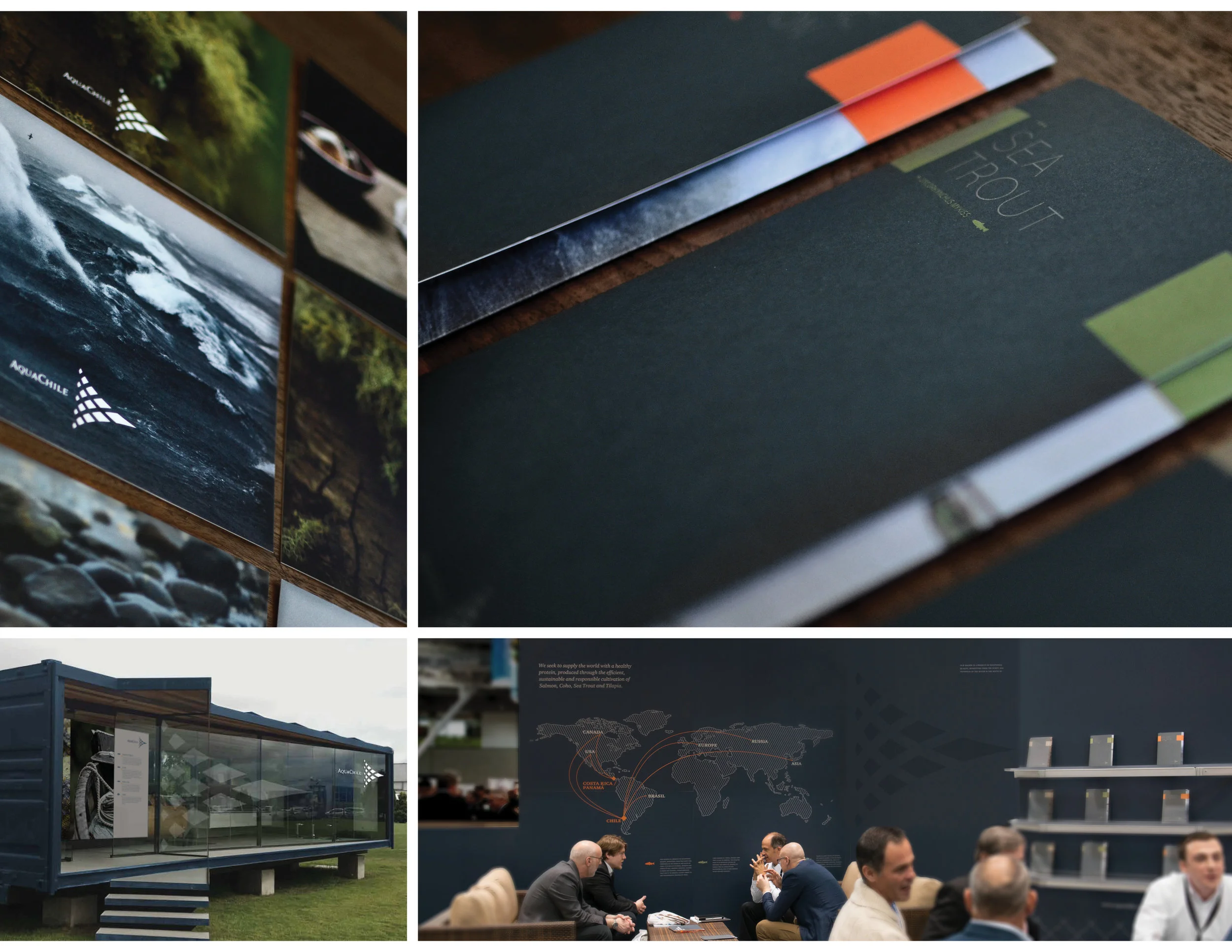
Editorial design, stores and stands
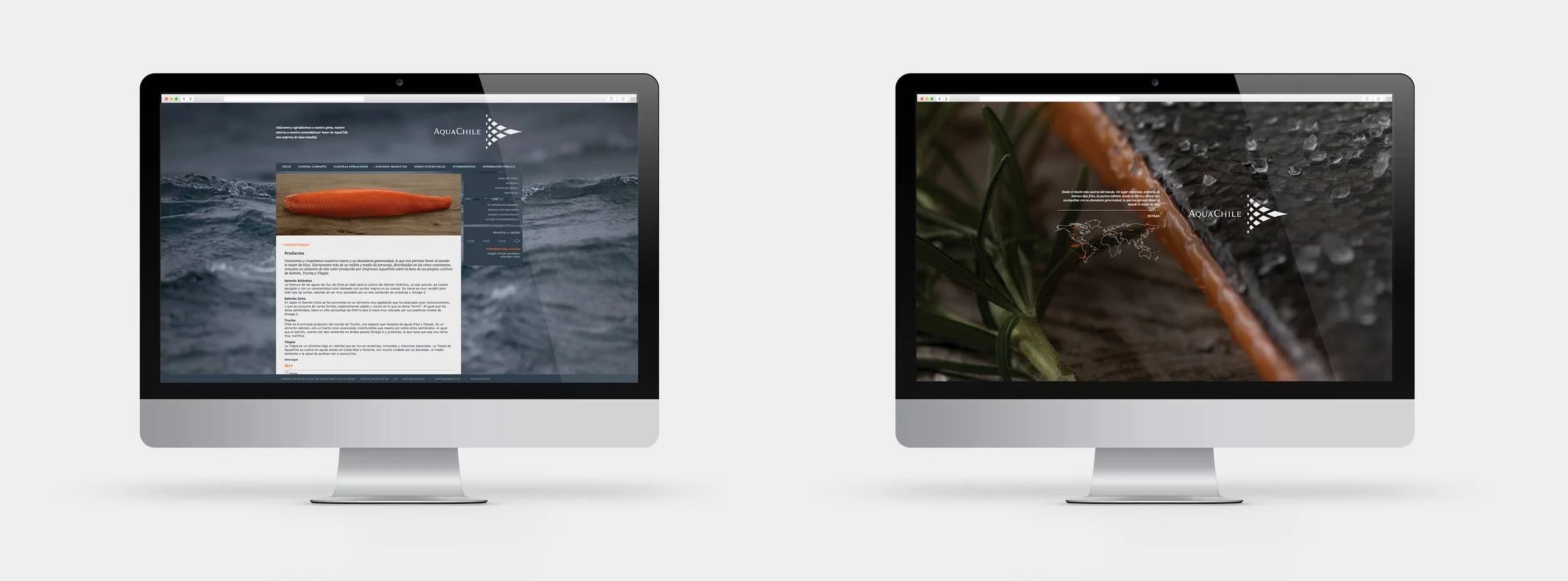
Website
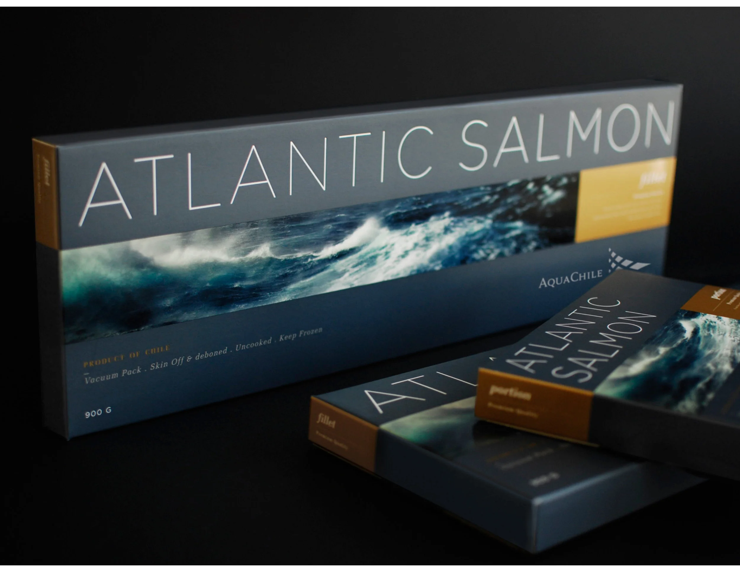
Packaging for premium products
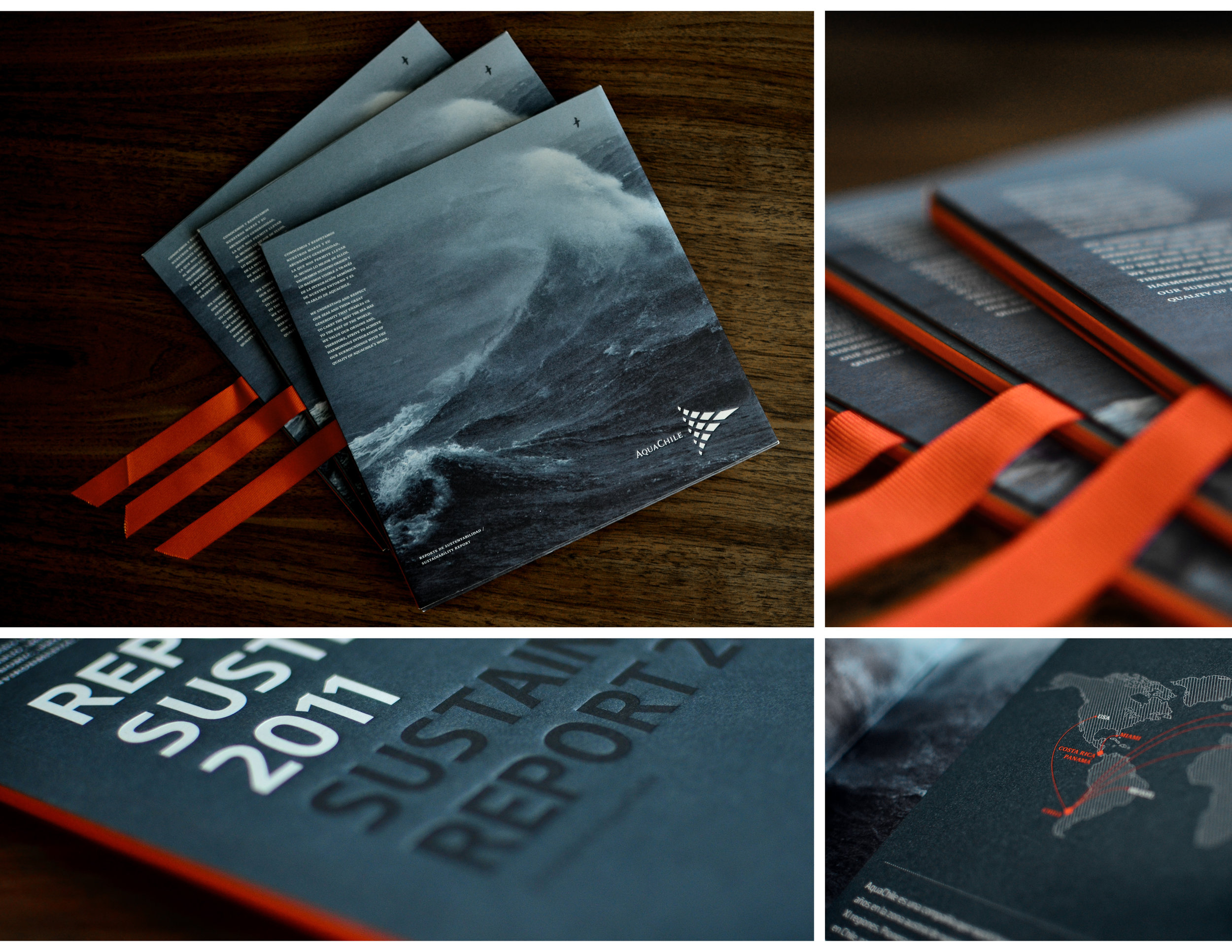
Sustainability Report