How to communicate tons of information on a website without overloading the user?
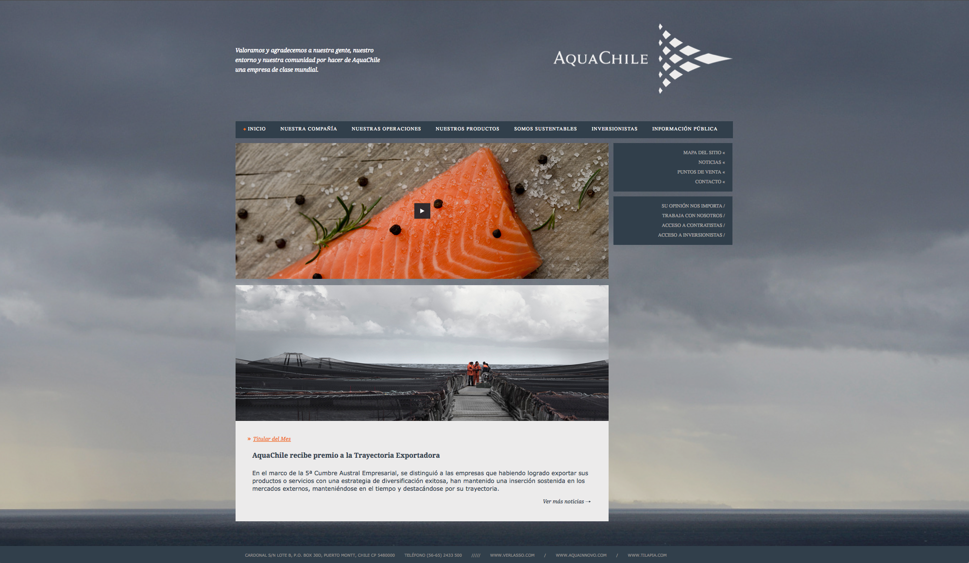
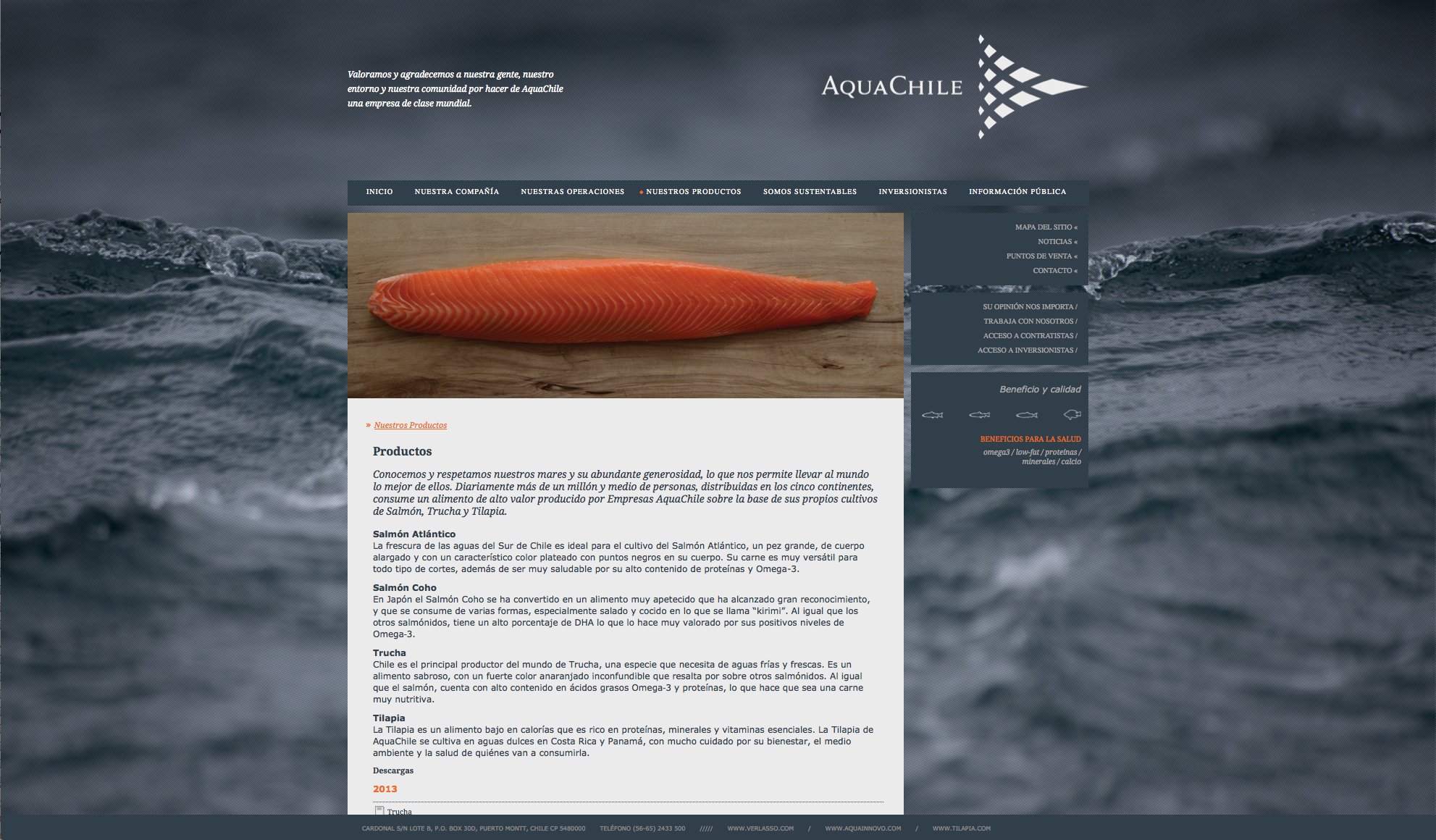
Our Challenge with AquaChile web page was to communicate a significant load of information within a clean and attractive platform. We solved this by designing a detailed information architecture that depicts the content in terms of what different users need from the web page. In this way, the web page allows multiple readings and navigation patterns depending on the user approach.


